Design Systems for Babbel
I joined Babbel, a language-learning company from Berlin as a product designer in August 2018. At the time the product design team headcount was seven product designers, one copywriter and one UX researcher. The operating model was similar to an internal agency servicing multiple agile teams (about six at the time, although the number of teams was rapidly increasing — there are more than 20 at the time of writing this study). Product designers collaborated with these agile teams mainly using design sprints, although the process of transforming it into a more meaningful long-term relationship was on the way.
We had the foundations of design system tooling in place to keep the experience cohesive, but without the dedicated maintainer, so it was up to every designer to be mindful of whether the results of their work should be shared with others. Babbel had just went through a visual style refresh in 2018 which was still not fully rolled out everywhere due to resource constraint, and new features, projects and experiments were rapidly pulling the cohesiveness apart.
The tooling itself was:
- A set of Sketch libraries distributed among designers with Google Drive
- A set of specifications in Zeplin for developers
- A SASS library to provide styling foundations for web technology stack
Evolving tooling for designers
At my previous job at MoneyMap I had a chance to try out Figma and I've quite enjoyed the following main advantage that it brought to the table:
Side-stepping the version control problem. While there are excellent tools such as Abstract that help a lot with the design process organization, version control in design tools can be quite messy. Syncing files manually, uploading them to multiple external tools (i.e. InVision for simple prototyping) and avoiding stepping on each others' toes requires effort from design teams. Figma does not give you “true” branching and versioning, but because it is a tool that runs in the cloud, you always have access to the latest version of version history.
For this and few other reasons (not the least of which were significant performance gains) for my third or fourth feature project instead of sticking to Sketch I switched over to Figma. I imported the latest versions of our UI kits and used them for that project while at the same time doing some refinements on DS components and thinking on how to organize the collaboration process with other designers a bit better.
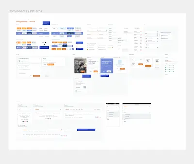
- I split up the monoliths of UI kits into individual libraries grouped by function (Buttons, Inputs etc.)
- Since designers were typically working on a feature for all our platforms the per-platform library separation didn't make much sense, per-platform variations were kept inside these functional groups
- Basic principles of semantic versioning were applied with changelog provided via Figma's version history and on Confluence (was deprecated later in favor of dedicated intranet-site for the design system)
- Basic guidelines for components were written down and put inside the libraries and description fields
By December it felt to me that it was in a good enough state to provide value to other designers, so I started onboarding the team members to Figma. I organized a couple of small workshops to showcase Figma's features and share some time-saving hints as well as showcase what I've built up to this point. In January 2019 the product design team switched over to Figma.
Bootstrapping system foundations
At the time the product org in Babbel was expanding rapidly with new additional teams being created. These teams were empowered to deliver features independently from the rest of the company by having all the disciplines inside them and having a decision power over their tech stack.
Most of the new teams were working with web technology, but an old SASS library was hard to fit into a greenfield projects. And of course for projects with mobile native code it was of little use. In December 2018 a few engineers from different agile teams decided to build a more modern foundation for the design system. I joined the project as a volunteer from the product design team. The new library was built using Amazon's Style Dictionary. It is a node package that transforms JSON style definitions into a variety of formats that could be consumed by all our teams.
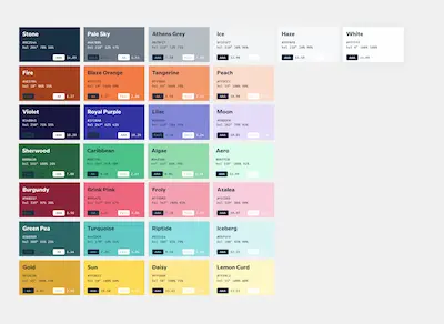
First initial releases were all about extracting the values out of the SASS library and doing testing on how well the output could be consumed in existing codebases. Eventually the SASS library that is still used in some legacy project started to use Design Tokens as a dependency making it the source of truth for all the foundational values (colors, typography etc.)
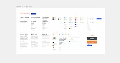
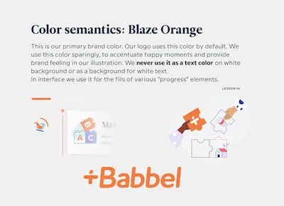
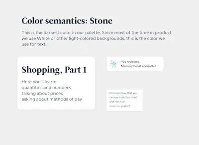
Meanwhile I started adding more functionality on top of it that coincided with design system refinements that were going on at the time. Throughout 2019 I collaborated with designers from product design team and from brand design team on refining our color palette. The existing one had contrast accessibility issues and was equally cumbersome to use in marketing and product. We worked in two small workgroups (1 product design + 1 brand designer). First, which I was a member of, looked at broad usage of color in the whole journey, its application in marketing and in product UI. Second was mostly looking at application of the palette in illustration and was also working on illustrations guidelines. By the end of summer 2019 we had a new refined color palette that both brand and product design were happy with.
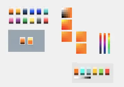
To help with transitioning to this new palette I've added a set of semantic tokens that simply referenced the base raw values.
"color": {
    "orange": { "#ff790f" },
    "semantic": {
        "primary": { "{color.orange}" }
    }
}
When switching from one palette to another sometimes you can just replace old colors with new ones, but often there's no direct match between old and new colors and palette size can be quite different too. What's more, the application of color may change. Nonetheless the rules of how you apply color in product UI currently can be expressed with this semantic naming and referencing, so it could help you with the transition when either the underlying raw values or the rules change.
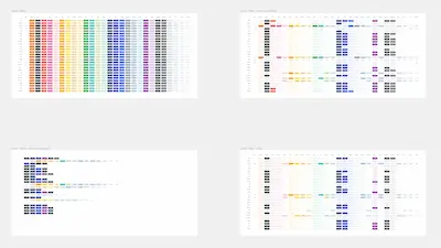
In designers' tooling solution was way less elegant and amounted to having a separate Figma library where values were copied between base palette and semantic styles using a naive plugin that simply read description fields looking for a name reference and then copied the style value.
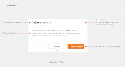
Aligning design and development
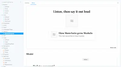
To help agile teams that were building new features based on prototypes that were made by designers in Figma I ran a few onboarding sessions for developers on inspecting the files and navigating around. I also made an MVP version of the documentation in the Form of a multi-page Figma document with guidelines and specifications.
Throughout 2019 I advocated to the product at design leadership for bringing in dedicated development resource to this project that I was pushing along. It's not that we didn't have the expertise in-house, but more of a question of priority. Having a dedicated maintainer for the design systems enables independent teams to contribute to it more efficiently. In my work as a keeper of Figma libraries I stuck to a very simple and open contribution process that encouraged everyone to contribute. Inevitably due to the domain expertise and them being primary users of Figma libraries, product designers amounted to the bulk of new solutions and refinements.
Nonetheless Figma tooling was growing among brand designers, instructional designers and various other disciplines. At the time of writing this among all the Figma users at Babbel it averages to a couple thousand inserts (new instances created) each week.
On the code side of things and in actual product though we had patchwork systems of components scattered in hundreds of repositories. I collaborated with teams on shipping small refinements in their libraries. While there was no shortage of exciting and interesting projects it was not the most efficient way of doing it.
Design system project needed real engineering resource and my skills and available time were not sufficient. In October 2019 the budget for this role inside product design team was approved, we started the hiring process. On March 1st 2020 a design systems engineer joined the team.
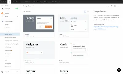
Building an MVP component library
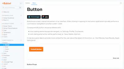
Over the course of 2020 we've built a small React UI kit written in Typescript. The choice of technology was mostly driven by the number of teams and projects that could use it and the team's experience being primarily with web tech stack.
Conventionally our library uses Storybook which we used to bootstrap a documentation intranet portal.
The library, of course, uses tokens as its base and we've building our kit while closely collaborating with the agile teams to be sure that whatever pieces we ship, it can be used since day one. Nonetheless we've put a great effort into making sure we got the foundations right and that those would support future design changes with minimal effort.
We started with foundational layout and text components. At the time Figma just shipped Auto Layout which reassured us we're on the right path to making designers and developers reason about this foundations from similar points of view.
Then we moved over to basic components such as buttons, inputs, icons etc. We've introduced small refinements along the way such as adding focus styling and making sure that screen readers would have a title to read even if visually the button has only an icon (and we show it in the tooltip as additional scaffolding too).
Embracing the imperfection
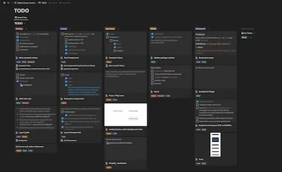
Development of the design system is coordinated with a very informal Kanban board and through constant communication. We talk with our users and anybody who's willing to contribute through a variety of channels: a literal Slack channel, pull requests on our main repository, a monthly conference call and countless private messages, emails and calls. Most important architectural and technical decisions are captured as decision documents with dates, reasoning, objections and considerations included.
Dealing with problems, inconsistencies, imperfections one by one we're building it bigger and bigger and more useful on each turn, all the while more and more engineers, designers and stakeholders are embracing it as the shared medium collectively controlled by all the different disciplines together.